First Impressions Start at the Gate: Six Exterior Details Worth Getting Right
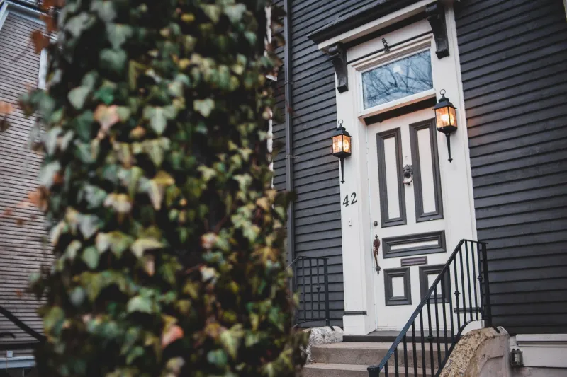
Kerb appeal is usually sold as a coat of paint and a hanging basket. It's more useful to think of it as a design system: a handful of repeatable decisions that either pull in the same direction or quietly bicker with each other. If you work from home, run something out of a converted garage, or simply want the place to read well from the pavement, the front of the house deserves the attention a brand gives its shopfront. Because that's what it is — the first thing anyone meets, before a word is spoken.
The pavement is your first touchpoint
Anyone who has sat through a branding session knows the drill: consistency beats novelty, and the details do the heavy lifting. Outside, that means a door, a number, a light, a mat and a bit of planting that look like they were chosen by the same person on the same afternoon. Most frontages that feel wrong aren't ugly. They're answering four different questions at once.
Decide what you want the house to say — solid and traditional, quietly modern, a bit eccentric — and let that single answer filter down. Two coats of paint later is an expensive way to discover you'd have preferred the third option.
1. Door colour: the anchor
Everything else negotiates with the door. Deep greens, inky blues and oxbloods are forgiving on period terraces and hide road grime better than anything pale. Brights — a proper pillar-box red, a confident mustard — work best where the houses are plain and the light is flat.
Weatherproofing matters more than the shade chart. Exterior timber needs a flexible finish that moves with the seasons; a hard, glassy paint on a south-facing door will craze within two winters. Prime bare wood properly, sand between coats, and accept three thin layers over one thick one. If the door is uPVC, don't paint it unless you've checked what your specific surface will take — and never do it in the cold.
2. House numbers: legibility first, personality second
A number nobody can read at dusk is a delivery problem and a design problem. Get the numerals big enough to be seen from the road, put them where a courier actually looks, and either light them or choose a finish that catches what light there is. Brass and powder-coated steel both age well. Stick-on vinyl does not.
Then have some fun. A tile plaque, a hand-painted numeral, a small name plate if the house has one — this is the cheapest place on the list to show character, and the least risky to change when you tire of it.
3. Lighting: solving the 4pm problem
For roughly four months of the year, the front of a British house is in darkness by the time anyone gets home. A single bulkhead over the door, on a timer or dusk sensor, does more for how the place feels than any amount of repainting. Warm white, not daylight — 2700K to 3000K flatters brick and paint alike.
If you want a second layer, path lights or a low bollard marking the step remove the awkward shuffle at the gate. Avoid anything that throws light into a neighbour's front window; the aim is welcome, not interrogation.
4. Hardware that survives a British winter
Knockers, letterplates, handles and hooks are where modest budgets go furthest. Choose solid brass, cast iron or marine-grade stainless. Be wary of anything described as an antique finish if it lives fully outdoors, unless you actively like the look of verdigris. A knocker in the same metal family as the letterplate and the house number is the exterior equivalent of matching logo, typeface and palette. It reads as deliberate rather than assembled.
While you're there: oil the hinges and fix the draught. A door that closes with a thud rather than a rattle is a branding decision, whatever the brand guidelines say.
5. The doormat, reconsidered
Coir is traditional, cheap and eventually composts. It also sheds. A rubber-backed coir, sized wider than the door, looks intentional; a thin one that slides underfoot looks like an afterthought. If the porch is covered you can be braver — a dark mat with a slim border, or a plain ribbed runner. If it's fully exposed, buy for drainage and accept that it will fade.
6. Porch planting that doesn't sulk
Two matching pots, same plant, same compost, is the most reliable move in the whole of kerb appeal. Bay, rosemary, box (watch for blight) or a tough evergreen such as sarcococca for winter scent. Terracotta if you can shelter it; frost-proof glazed pots or fibreglass if you can't. Big pots, fewer of them, watered properly — a row of small dry pots reads as neglect faster than bare flagstones.
Period-property etiquette
In a conservation area, or on a terrace with a shared elevation, the courteous move is to stay within the grammar of the street. That doesn't mean beige. It means matching proportions, keeping an original door if you possibly can, and not bolting a modern lantern across a Georgian fanlight. If the building is listed or you're in a conservation area, check before changing anything that needs consent — replacing a door or laying a hard surface can both require permission, and it is a far cheaper conversation to have first.
Three budget tiers
Under £100: a new number, a new coir mat, a decent warm-white bulb in the existing porch light, and an afternoon with a stiff brush and hot soapy water on the step.
£100–£400: repaint the door properly, replace the letterplate and knocker in one metal, add a dusk-to-dawn sensor.
£400 and up: new door furniture throughout, a two-layer lighting scheme, matching frost-proof pots, and a joiner to sort the threshold and the draught.
The pavement test
Stand at the gate at dusk, in the rain, and look at the house as though you've never seen it before. Whatever your eye trips over is what a visitor trips over too. Fix that one thing first, then do it again in a fortnight.
That's the whole system, really: fewer decisions, made once, held consistently. Which is exactly what good branding has always been.