Blue Doesn't Travel Light: Keeping One Brand Colour Honest on Screens, Signage and Sofas
Photo: Unknown authorUnknown author, Public domain, via Wikimedia Commons
A brand blue is rarely one thing. It is a set of instructions interpreted by a screen, a printer, a sign-maker and a fabric mill. That is why the same blue can feel bright and certain on your laptop, slightly muddy on a shopfront, and oddly heavy on a sofa. If you have ever approved a colour on screen and then met something different in real life, you are not being precious. You are running into physics.
The useful response is not to chase a perfect mathematical match everywhere. It is to decide what the colour is meant to do, give every supplier the same clear reference, and check it on the material that will actually carry it. Colour consistency is one of those quiet signals of professionalism. Customers may not know why your shopfront, packaging and interior feel related, but they notice when they do not.
Start with a master reference, not a memory
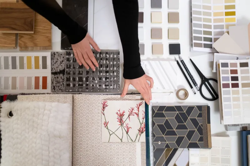
Before anyone prints, cuts or upholsters anything, define the master colour. That might be a Pantone reference, a CMYK build, an RGB value for digital use, and a physical swatch kept in a folder. The mistake is saying “the same blue as the website” and hoping everyone pictures the same thing.
Blue is especially slippery because small shifts read as different moods. A blue with a little more red can feel purple. A blue with more green can feel teal or municipal. A blue that looks rich on a backlit screen can print flatter because paper absorbs light differently. None of this means the colour is wrong. It means the brief needs to be specific.
For UK small businesses, it helps to keep a simple colour sheet with the brand blue named, referenced and described in plain words: deep navy, bright cobalt, soft grey-blue. Add a short note on what to avoid — “not purple”, “not green”, “no metallic finish” — because suppliers deal with dozens of blues a week.
A screen is a mood, not a match
Screens are useful for design and terrible for final colour approval. Your monitor may be brighter than your customer’s phone. Your phone may be warmer than your laptop. A deep blue viewed at full brightness can look almost black at a lower setting.
Use the screen to explore, not to sign off. If you need to check a digital blue, view it on more than one device at a sensible brightness and compare it with a physical swatch where possible. For print, ask for a hard proof rather than trusting a PDF. For signage, ask for a sample of the actual vinyl or acrylic. The question is not “does this look right on my screen?” but “does this look right on the thing the customer will see?”
Brief the printer and sign-maker in their language
Printers think in CMYK, paper stock and ink coverage. Sign-makers think in vinyl, acrylic, laminate, finish and viewing distance. Both can hit your blue, but they need to know which blue matters and where it will live.
With a printer, ask for a proof on the intended stock. A coated paper will hold a blue differently from an uncoated one. If the blue is central to the brand, say so early. Some rich blues need a special ink or a careful CMYK build; a casual “just make it blue” can end up with a slightly dull result that nobody notices until the leaflets arrive.
With a sign-maker, ask what substrate and finish they recommend, then request a physical sample. Gloss laminate can make a blue look deeper and more saturated. Matte finishes can soften it. Outdoor light will change it again. A shopfront blue that looks elegant at dusk may look flat at midday, so check the sample against the building rather than in the back of a van.
Let the fabric have a say
Soft furnishing is where brand colour often becomes most human. Upholstery fabric is not a flat printed surface. Weave, pile, fibre and dye lot all affect how blue appears. Velvet can swallow light and read almost black in a corner. Linen can look chalky and relaxed. A tight weave may make the same blue feel sharper and more corporate.
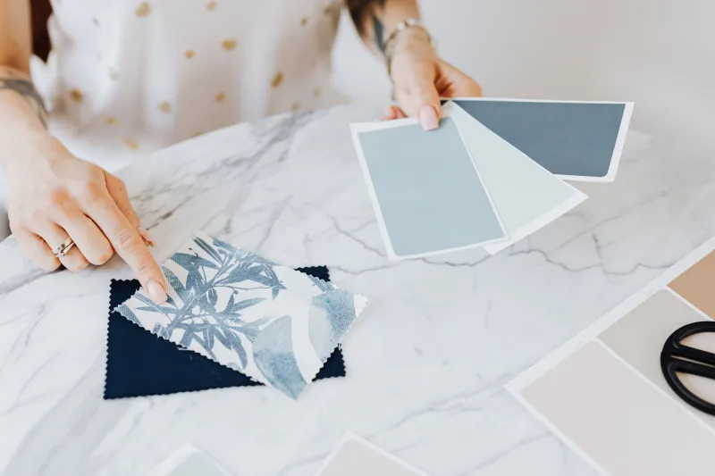
Ask your upholsterer or fabric supplier for a cutting, not a screen image. View it in the room where it will live, in daylight and under the lamps you actually use. A north-facing British living room can make a warm blue feel cooler; a warm bulb can push it towards grey. Pin the sample against the wall, next to the flooring and beside any other fabrics it will sit with. Blue changes according to its neighbours.
If the fabric is for a client-facing space, keep a record of the dye lot. Two batches of the same named colour can differ slightly, and that is normal. The aim is not to pretend variation does not exist. The aim is to make sure everyone approved the variation before it became a sofa.
Test the colour where it will be seen
A colour test is not a luxury. It is the cheapest part of the project. Paint a large patch on the wall rather than a tiny square. Take a signage sample outside and look at it from across the street. Drape the fabric sample over a chair and walk past it at different times of day.
Compare the blue with the materials it will meet: white walls, grey carpets, oak floors, black window frames, brushed steel handles. A blue that feels crisp beside pure white can feel sombre beside cream. A blue that looks confident on a standalone sample can disappear against a busy background.
This is also where lighting tests earn their keep. Check in morning light, under artificial light and on a dull afternoon. You do not need to be scientific about it. You need to see the colour in the conditions your customers will actually experience.
Use a one-page sign-off sheet
A simple sign-off sheet prevents a lot of quiet drift. It does not need to be complicated. Include the project name, the master colour reference, the supplier, the material or substrate, the finish, the batch or dye lot where relevant, and a note of where the sample was checked. Add a line saying “approved as physical sample, not screen” and a date and signature.
Keep a copy with the physical sample. When someone asks why the shopfront blue is slightly deeper than the leaflet blue, you can show that both were approved for their materials and that the difference was a deliberate part of the process. That is far more professional than blaming the printer.
Aim for family resemblance, not identical twins
One brand blue across screen, signage and soft furnishing will never behave identically. Different materials have different rules. What you can do is keep the colour in the same family: the same temperature, the same level of depth, the same feeling of restraint or energy. Decide what matters most — hue, brightness, mood — and protect that.
If a material simply will not carry the master blue well, choose a considered secondary rather than forcing a bad match. A calm grey-blue on fabric, a deeper blue on signage and a brighter blue for digital can all belong to the same brand if the relationships are clear. Consistency is not a laboratory result. It is a promise that the colour was chosen, briefed and checked with care. And that quiet care is exactly what clients remember.