The Discipline of One Room: How a Focused Interior Edit Sharpens Your Business Identity
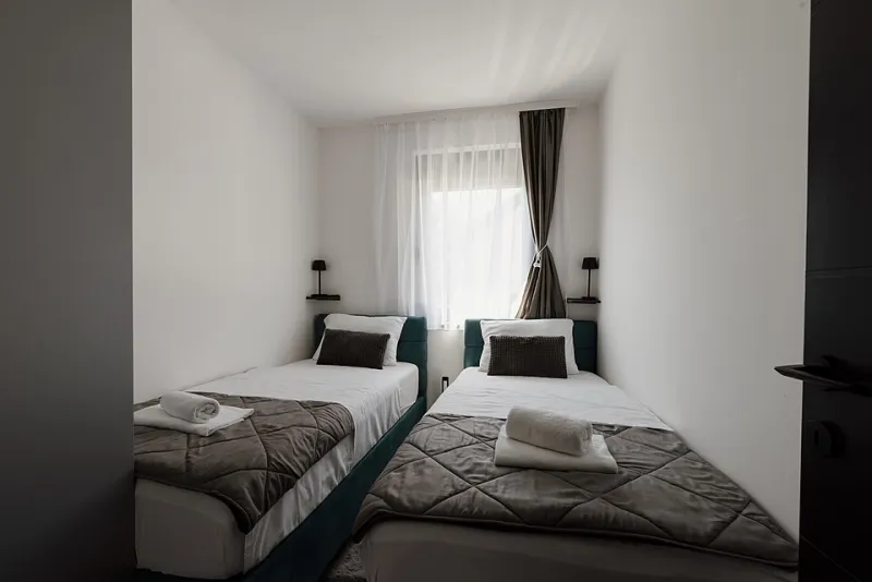
Photo: Shixart1985, CC BY 2.0, via Wikimedia Commons
There is a particular kind of optimism that arrives with a whole-house project. Sketches get pinned up, sample pots multiply, and for a few heady weeks every room feels possible. Then the decisions pile up—tiles, handles, lighting circuits, whether the understairs cupboard really needs a dedicated charging drawer—and the original idea gets buried under logistics. Most of us don't need a bigger project. We need a smaller one, finished properly.
That's the case for the single-room rebrand. Pick one space, strip it back, restyle it with intention, and live with the result. You'll learn more about how you make decisions—and what your taste actually says about you—than you would from a year of scrolling. The same discipline, applied to a business, is the difference between a brand that looks busy and one that looks sure of itself.
Why one room beats the whole-house blitz
A single room gives you a controlled experiment. The variables are limited, the budget is survivable, and the feedback loop is short. You can see the consequences of a colour choice by teatime rather than in eighteen months. That speed matters, because most design decisions are not about right and wrong—they're about consequence. A tight brief makes those consequences visible.
It's also a lesson in restraint. When you only have one room to work with, every object has to justify itself. The empty corner stays empty. The fourth cushion doesn't get bought. That pressure is useful, and it's exactly the pressure a strong brand operates under. A logo, a palette, a tone of voice: each element has to earn its place, because there is no room for filler.
The three-question audit
Before you move a single chair, run the room through three questions. They're deliberately blunt.
- What is this room actually for? Not what the estate agent called it, and not what the Pinterest board implies. If the box room is where you take client calls, store the ironing board and dry laundry, say so. Honesty at this stage saves a fortune later.
- What must stay? The original cornice, the inherited armchair, the awkward radiator you can't move. These constraints are not obstacles; they're the character. In brand terms, this is your equity—the things customers would notice if they disappeared.
- What earns its place? Everything else has to answer this. If a piece of furniture, a colour or a decorative object can't explain why it's there, it goes into the maybe pile.
Run the same three questions over your business and the overlap is unmistakable. What is the business for, really? What must stay because it's recognisably you? And what is only there because it's always been there?
Before and after is mostly about editing
The satisfying 'after' photographs you see online rarely come from adding more. They come from subtraction, then one or two confident gestures. A Leeds copywriter I know restyled a spare bedroom into a working studio in a fortnight. The before shot was a beige holding pen for exercise bikes and unopened boxes. The after was a single desk under the window, a pinboard, two shelves and a very deliberate absence of clutter. The gesture—the one thing anyone remembers—was a deep green wall behind the desk, painted only as far as the chimney breast.
That's the pattern. Edit hard, then commit to one memorable move. A brand built the same way tends to feel calm and legible: a clean typographic system, a tight palette, one signature detail used consistently. Nothing shouts, but nothing is accidental either.
The palette test
Try limiting the room to three tones: a dominant, a secondary and an accent. In a north-facing Victorian terrace, that might mean a warm off-white, a soft clay and a single hit of ochre on the inside of a door. The restriction forces you to notice how light behaves in the room across the day—something no paint chart can tell you.
Then notice how quickly the restriction becomes a personality. A room with three tones reads as considered. A room with nine reads as undecided. Brands work the same way. The most confident identities in the UK right now are not the loudest; they're the ones using a narrow set of colours and typefaces with enough consistency that you could recognise them from a crop.
What survives the edit is the brand
When you clear a room, a small pile of 'keep' objects tends to form—the things that didn't need to be justified. A particular lamp, a print bought on a trip, a chair that's simply comfortable. That pile is worth studying. It's your instinctive taste, before the trends got involved.
Do the same with your business. Which piece of communication do you keep coming back to? Which client compliment repeats? Which part of the service do you quietly enjoy most? These are the seeds of a brand position that will hold up when the market shifts. They're also cheaper to build on than a wholesale reinvention.
Bring it back to the business
Once the room is finished, write a one-page 'brand sheet' for it: purpose, three adjectives, palette, one signature detail, and one thing you refuse to include. Then write the same sheet for your business. The gaps are instructive. If the room feels calmer and more decisive than the company, that's your next project—not another room.
A single resolved space won't change your life. But it will show you what your judgement looks like when it isn't spread thin. That's the real before-and-after: not the paint, but the proof that you can make a decision and let it stand. In 2026, with budgets tight and attention tighter, that kind of discipline is more persuasive than any full-scale overhaul.