The A4 Brand Sheet: Keeping Quotes, Posts and Signage on the Same Wavelength
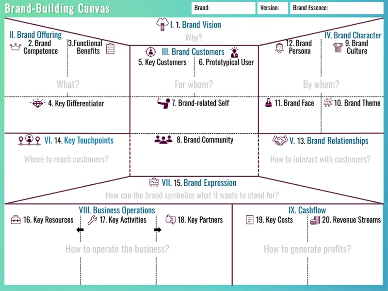
Photo: Branding101, CC BY-SA 4.0, via Wikimedia Commons
Somewhere in a shared drive, there is a brand document with a beautiful cover and a contents page. It probably has a section called 'Brand Essence' and another called 'Visual Language'. It was signed off in a meeting with nice biscuits. And nobody has opened it since.
That is not a failure of design. It is a failure of format. Most small UK businesses do not need a manual that reads like a planning application. They need one page that answers the questions that actually come up: which blue is the blue, which font goes on the quote, can I use this photo, and how do I name the file so the printer does not hate me.
Why the heavy document loses
A long brand bible is written for the moment of launch, when everyone is excited and the agency is still on the email thread. It is not written for the wet Wednesday in November when you are sending a quote from your kitchen table and the client has asked for 'the logo in a format I can open'.
The longer the document, the more it behaves like a reference book: respected, dusted occasionally, never consulted mid-task. A one-page sheet is different. It sits on the fridge door, the studio wall or the desktop. It gets used because it does not ask for twenty minutes of your life.
The test it has to pass
Before you write anything, set a simple standard. Could a new freelancer, a print shop in another city or a Saturday market helper use this page without ringing you? If the answer is no, the page is doing too little. If the answer is 'they would need a tutorial', it is doing too much.
The aim is not to describe your brand. The aim is to prevent the small drift that makes a business look like several unrelated businesses. One slightly different green here, one rogue font there, and the quote PDF starts to look like it came from a different company than the Instagram post.
The template, line by line
Use one side of A4. If you must go to two sides, make the second side the 'examples' side, not more theory. Start with your logo lock-up at the top, a line saying which version is preferred, and a note on clear space. Then give the rest of the page to five practical sections.
Colour: hex codes, not vibes
List a primary colour, a secondary, two neutrals and one accent. That is enough. Put the hex code next to each swatch, and add CMYK values if anything regularly goes to print. Write the rule in plain English: 'Use the dark neutral for body text, not pure black' or 'The accent is for buttons and small highlights only'. If you have a colour you love but cannot use consistently, leave it off. A palette is a decision, not a mood board.
Type: two faces and a pecking order
Choose two typefaces: one for headlines, one for body text. If you are using a free Google font and a system font, say so. Add the sizes you actually use for an A4 quote, a social post and a slide title. Then write the boring but useful rule: 'No third font. No stretched logos. No all-caps paragraphs.' The person laying out a last-minute flyer will thank you.
Photos: a short list of rules
Most small businesses do not need a photography manual. They need guardrails. Note whether you prefer natural light or flash, whether filters are allowed, how tight the crops should be, and whether people should appear in shots. Add one line about what to avoid: heavy vignettes, cluttered backgrounds, stock photos of handshakes. If you have three hero images that sum up the look, put them in a row. Images do more work than paragraphs.
Tone of voice: write the sentences
This is where most guides go abstract and lose the room. Instead of 'friendly but professional', write three real examples. One reply to a new enquiry. One apology for a late delivery. One social caption. Then add a short 'avoid' list: no exclamation marks in invoices, no jargon in quotes, no 'Dear valued customer' if you would never say it out loud. The examples are the guide. The adjectives are just decoration.
File names: the unglamorous hero
Set a naming convention and stick to it: client-project-date-version. Use lowercase and hyphens. Say where files live: the shared drive, not a desktop. Note the formats you keep for print and screen. This section feels administrative because it is, and that is exactly why it saves time. Future-you will be able to find the right logo without opening twelve folders called 'Final Final'.
The seven-day road test
A brand sheet is only useful if it survives real work. Test it for a week. On Monday, use it to lay out a quote. On Tuesday, use it for a social post. On Wednesday, check a piece of print or signage against it. On Thursday, write a client email using the tone examples. On Friday, name and save every file according to the convention.
At the end of the week, note what you had to guess. If you had to guess, the page is missing a line. If you ignored the page entirely, it is too long or too fussy. Adjust it once, then stop. A brand sheet is a working document, not a monument.
What to leave off
Leave off the mission statement unless it genuinely helps someone make a design decision. Leave off the brand pyramid, the aspirational mood words and the three-page explanation of your values. If you need a values line, keep it to one sentence at the top. The rest of the page should be instructions, examples and limits.
Print it, pin it, move on
Date the sheet and give it a version number. Review it twice a year, or when something changes: a new service, a new font, a new print supplier. Then put it where people will see it. The best brand guide is not the most thorough one. It is the one that is still on the wall when the next quote goes out.