The Drawer Clients Keep Coming Back To: Building a Sample Library That Speaks Plainly

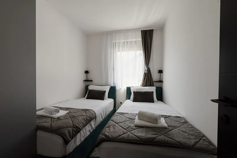
Photo: Janine Stone & Co., CC BY-SA 4.0, via Wikimedia Commons
There is a moment in most design meetings when a client nods politely at a screen full of references and you can see the decision has not landed. The images are lovely, the palette is doing the right things, but it is all a bit theoretical. Then you put a paint chip in their hand, or a square of wool, and the conversation changes. People stroke it. They hold it up to the window. They ask whether it will work beside the kitchen tiles. That is the point of a physical sample library: not to decorate your studio, but to turn a design direction into something a client can believe in.
For a UK audience, this matters especially. Our light is not a constant. A colour that looks calm on a laptop at 3pm can go flat against a north-facing wall in November. A paper stock that reads as "premium" on screen can feel thin in the hand. A sample library is a small, practical answer to both problems. It lets branding and interiors be judged the same way — by eye, by touch, and by the slightly unforgiving light coming through the meeting-room window.
Curate a working box, not a museum
The temptation is to collect everything. Resist it. A good sample library is edited, not exhaustive. Start with a handful of families: paint, fabric, tile, wood, paper. For each project, pull six to ten paint chips, not sixty. Three or four fabric swatches. Two paper stocks that show the difference between a matte uncoated sheet and a coated one. A couple of tile chips and a sealed wood offcut. The aim is clarity, not a jumble sale.
Keep the pieces big enough to read. Paint chips at roughly A6, fabric cut to 10cm squares, paper trimmed to postcard size. Wood offcuts should be sanded on one face and sealed, so clients are not distracted by splinters. Tile samples can be small, but make sure the glaze is visible. If a sample is too precious to be handled, it is probably not doing its job.
Label it as if someone else will use it
A sample library only works if it can be navigated by someone who is not you. Write the supplier, product name, code, finish and date on the back of every piece. Use pencil for light materials and a fine permanent marker for darker ones. Group by colour family or material type, whichever suits the way you talk about projects. Tabs help. So does a shallow box with dividers — the sort of thing you can carry into a meeting without needing a trolley.
There is a quiet professional pleasure in a well-labelled drawer. It says you have done this before. It also saves the small, avoidable embarrassment of holding up a beautiful swatch and not being able to say what it is.
Present in threes, not in bulk
The biggest mistake with a sample library is bringing all of it. A client meeting is not a browse; it is a decision. Before the meeting, edit down to three small groups. One group is the main direction. One is a warmer or cooler alternative. One is a wild card that shows you have thought beyond the obvious. Lay them out on a plain table, with a little space between each group. Then stop talking for a moment and let the client touch.
Ask simple questions. "How does that feel next to the floor?" "Does this paper feel too shiny for the tone you want?" "Can you see this colour in the evening?" You will learn more from a client's hand hovering over a swatch than from a long explanation.
Texture does the explaining
A screen can show a colour. It cannot show the slub in a linen, the grain in an oak offcut, or the difference between a 120gsm uncoated paper and a 300gsm board. Those details matter to UK clients because they are the difference between a brand that feels considered and one that feels printed in a hurry. They matter in interiors too: the same grey can read warm against wool and cold against tile.
A physical sample also makes cost easier to discuss. People understand why a heavier paper costs more when they hold it. They understand why a bespoke joinery finish takes time when they see the sample. The library does not just sell a look; it explains the work.
Keep it alive
Sample libraries go stale. Papers get discontinued, paint ranges change, and that perfect tile may be out of stock by the time a project starts. Set aside half an hour every month to check what is still available and to retire anything tired or damaged. Store the box flat, away from radiators and damp. Keep a small digital index if you like, but do not let it replace the physical pieces. The point is the hand, not the database.
A good sample library is not a shrine to good taste. It is a working tool, like a tape measure or a decent pair of scissors. It helps clients make decisions, helps you explain them, and helps both sides remember what was agreed. In a market where so much design conversation happens through a screen, a well-edited box of textures is quietly persuasive. It says: here, this is real. Have a look. Have a feel. That is usually enough.