Before You Order a Sample: Turning Design Buzzwords Into a Buildable Brief
Photo: HelsinkiArtBeat, CC BY-SA 4.0, via Wikimedia Commons
Most projects begin with a sentence rather than a sample. A client says they want something 'warm and minimal' or 'quietly luxurious', and everyone in the room nods. The trouble is that those words are not specifications. They are feelings wearing a coat. Before you order paint charts, tiles or a new sofa, you need to turn the feeling into decisions you can quote, order and defend.
That is not about being pedantic. It is about protecting the client from a costly mismatch between the room in their head and the room that arrives on a pallet. In the UK, where so many homes come with narrow hallways, north-facing living rooms and a radiator exactly where you least want one, vague language gets expensive quickly.
Start with a shared vocabulary, not a shopping list
When a client uses a trend phrase, resist the urge to translate it immediately into products. Ask three questions instead. What room in your life does this phrase remind you of? What should the space never feel like? And which two or three materials do you instinctively associate with it?
The answers will differ wildly. One person's 'warm minimalism' is a limewashed cottage with wool cushions and almost nothing on the walls. Another person's is a crisp city flat with hidden storage and one very good chair. Both can be right, but they cannot share the same sample board.
Write the phrase at the top of a sheet of paper and add the client's own words underneath. That sheet becomes the brief, not the mood board. Mood boards show taste. A brief shows agreement.
'Warm minimalism': less clutter, more texture
This is the phrase most likely to be misunderstood as 'beige everything'. Warm minimalism is not about removing colour until the room looks like a hotel corridor. It is about reducing visual noise while increasing physical comfort.
In practice, that usually means a base palette of off-white, clay, mushroom or soft stone, with one deeper tone for grounding — an olive joinery colour, a chocolate floor or a muted terracotta. Avoid cool blue-greys unless the room has strong southern light and the client genuinely wants a cooler mood.
Materials matter more than colours here. Think lime plaster, oak, wool, linen, brushed brass used sparingly, and matte finishes that absorb light rather than bounce it. Furniture should earn its footprint: low-profile sofas, rounded edges, simple side tables, no visual shouting. If the project includes branding, the same logic applies — a humanist sans-serif, generous spacing, and one accent colour rather than five.
A useful test: cover the room's soft furnishings with a sheet and look at what remains. If the answer is 'a lot of empty surfaces and one lovely lamp', you are close.
'Quiet luxury': restraint with proof of quality
Quiet luxury has become a shorthand for expensive-looking calm, but it is not a licence to spend indiscriminately. It is about fewer pieces, better materials and a refusal to be flashy. The danger is that it slides into a showroom palette with no personality and a lot of shiny brass.
Translate it into deep, grounded colours — ink, olive, chocolate, charcoal — used on walls, joinery or upholstery. Finishes should be matte or eggshell rather than high-gloss. Materials should feel honest: solid timber, heavy curtains, honed stone rather than polished marble, wool rather than a synthetic mix that photographs well and wears badly.
Furniture should be tailored but not stiff. A sofa with a clean line and a comfortable seat beats a statement piece that nobody wants to sit on. In branding terms, quiet luxury often looks like a restrained serif, a limited palette and plenty of white space — not a logo covered in gold foil.
For UK clients, discuss light early. A deep olive wall in a north-facing Victorian terrace can look almost black by 4pm in November. Ask whether the client wants that drama or whether they need a lighter version of the same idea.
'Heritage with a modern edge': old bones, clean lines
This phrase usually appears in period homes where the client loves the cornicing but does not want to live in a museum. The translation is not 'knock everything through and add a crittall door'. It is about keeping the features that carry character and inserting modern elements with confidence.
Paint is the simplest tool. Strong colour on joinery — a muted green, a dusty blue, a deep red-brown — can make original details feel deliberate rather than dated. Keep walls quieter if the architecture is busy. Materials can mix reclaimed timber with clean plaster, aged brass with matte black, antique furniture with a contemporary lamp.
If the project includes a brand identity, heritage with a modern edge might mean a classic serif paired with a grotesk, or a traditional signwriting style applied to a very simple layout. The point is tension, not pastiche.
The worksheet: four columns that stop the drift
Use a single page for each key room or brand touchpoint. Keep it blunt.
| Client phrase | What it means in this room | Three finish decisions | Budget note |
|---|---|---|---|
| Warm minimalism | Calm, textured, not cold | Mushroom walls; oak floor; wool sofa | Spend on texture, save on clutter |
| Quiet luxury | Restrained, well-made, low shine | Olive joinery; honed stone; heavy linen | Spend on one hero material |
| Heritage with an edge | Original features plus clean insertions | Strong joinery colour; matte black hardware; antique mirror | Spend on joinery, save on accessories |
The final column matters as much as the first. A phrase without a budget line is a wish. A phrase with a budget line becomes a decision.
Agree the samples, then stop collecting them
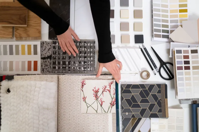
Once the worksheet is filled in, choose no more than three samples per surface and view them in the actual room at different times of day. Natural light in a UK winter is not the same as the lighting in a showroom, and a colour that looks warm at 10am can look grey by 3pm.
Ask the client to sign off the sample board and the worksheet together. That does not mean the project cannot evolve, but it does mean the conversation has a reference point. When someone later asks for 'something warmer', you can point to the agreed definition rather than starting again.
Trend language will keep moving. The brief should not. Get the words translated into finishes, fonts and furniture before the first order goes out, and the room has a far better chance of matching the sentence that started it.